Canadian Hydrogen Association
The Canadian Hydrogen Association (CHA), formerly known as the Canadian Hydrogen and Fuel Cell Association (CHFCA), champions the advancement of the hydrogen sector and represents over 200 diverse organizations across the value chain. Excelling in advocacy, government relations, international partnerships, and events, the Canadian Hydrogen Association provides critical resources to position Canada and its members as global leaders in the hydrogen space.
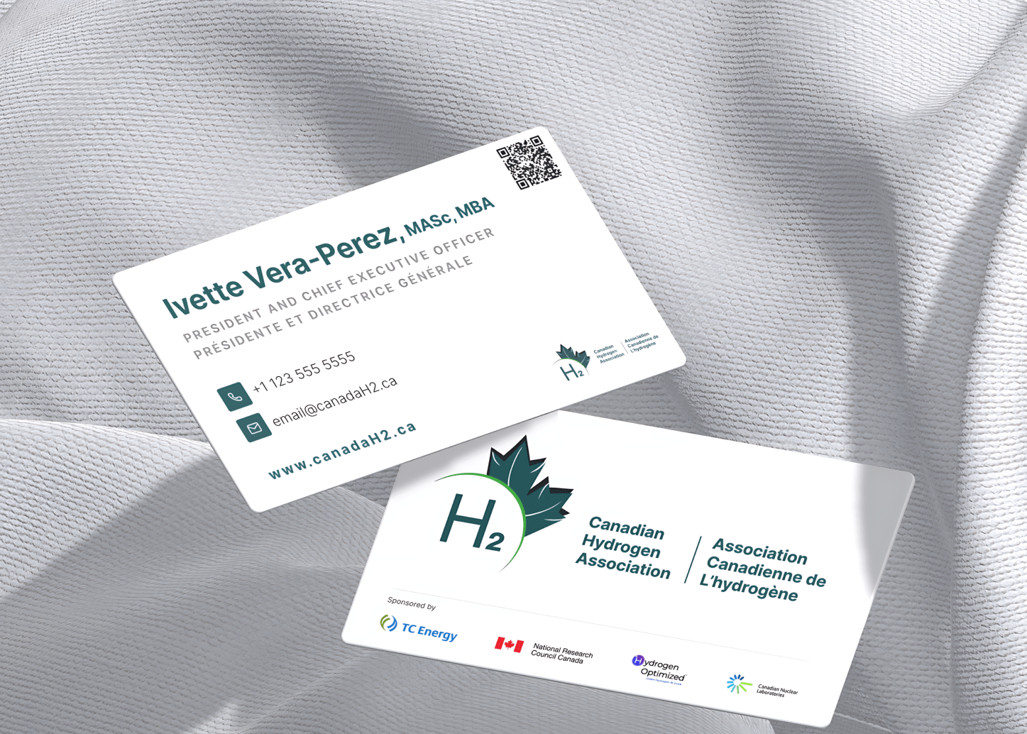
ShareCo partnered with the CHA to launch a full-scale rebrand with a meaningful new visual identity, website design and development, branding guidelines and strategies, social media content designs and guidelines, physical collateral such as business cards, brochure designs, tradeshow booth designs, internal assets, and a streamlined automation system for member onboarding and prospecting.
- Strategy
- Brand and Visual Identity
- UI/UX Design
- Development
- Automation


Defining the Brand
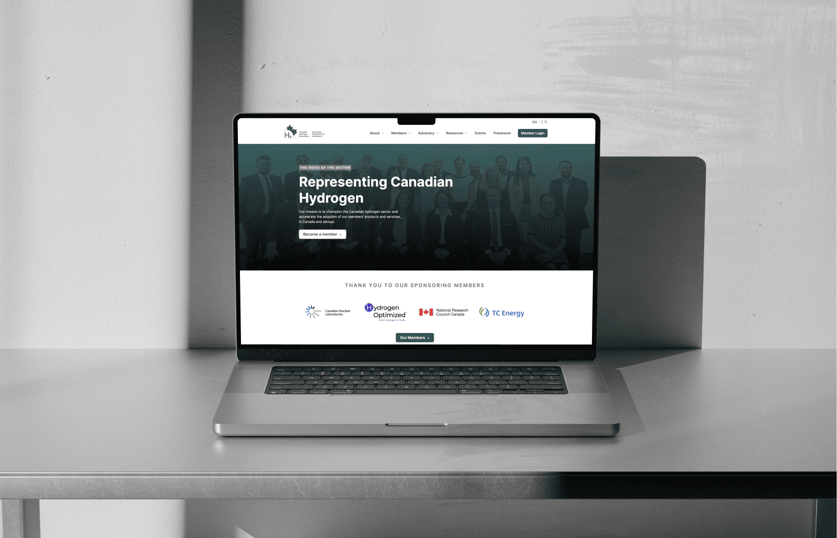
The CHA stands for its members across the hydrogen value chain, encompassing diverse technologies and stakeholders. We sought to capitalize on the servant leadership the CHA embodied through its new branding. The homepage leverages member pictures, testimonials, and achievements on behalf of members to make an emotional connection with the user, highlighting the benefits of being involved with the association.
Visual Identity
We designed CHA’s visual identity with the use case in mind. Through a blend of simple typography, a bold logo reminiscent of the iconic Canadian maple leaf, and a sleek but neutral color palette, we sought to not only make the CHA’s new brand memorable but also functional. The new logo symbolizes growth, innovation, and national pride, resonating deeply with CHA’s mission and values.
Not just a solution, but an experience.
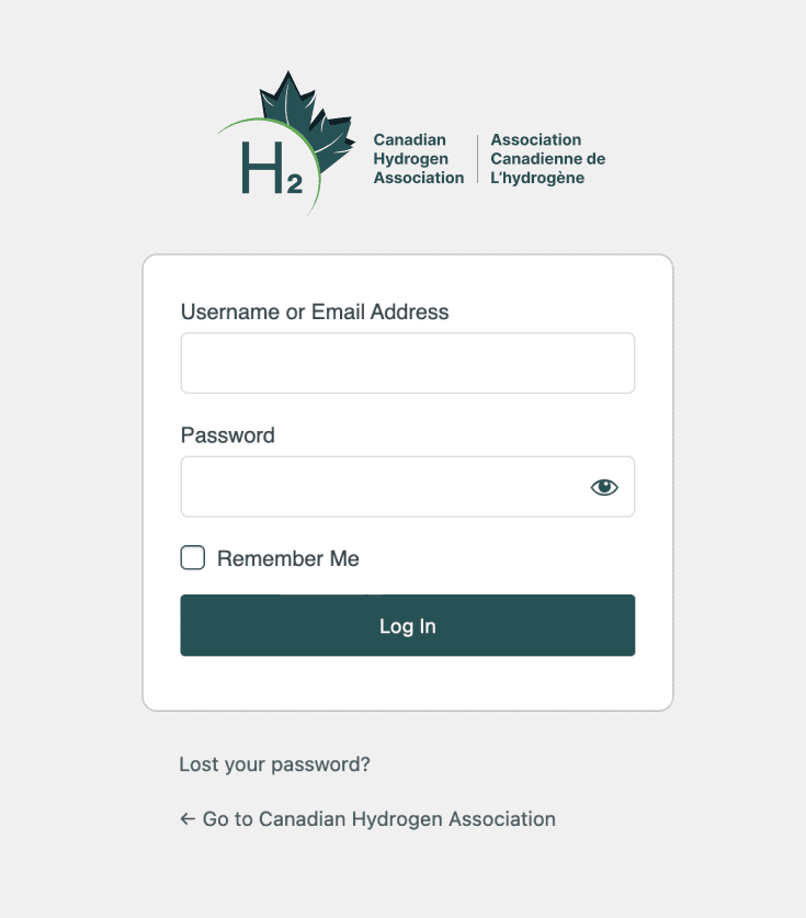
ShareCo created a user-centric website that is both visually appealing and highly functional. The new site features an intuitive navigation structure, responsive design, and enhanced content management system, ensuring that users can easily access information on CHA’s initiatives, member services, and upcoming events. To engage users, each page’s design was made with value in mind, scrapping anything redundant or flowery. For example, to organize the CHA’s informational and awareness content, we developed an education centre to aid in their awareness activities. The convenience for updating and future internal work was kept in mind for a seamless transition from ShareCo to staff. Additionally at ShareCo, we value accessibility thus, all websites created by us are accompanied by an accessibility plan.


Typography and Color Palette
To be inclusive of all members across the hydrogen space, ShareCo chose a specific shade of teal that stood neutral in the space. As a mediating voice of politically-driven industry, it was important to make sure that the colors chosen could not be misconstrued as alienating specific stakeholders. Building off this one color, we developed a palette that extended into a grayscale palette to cover all the required uses. The Inter typeface was chosen to give the brand a modern, but timeless look which could easily be translated into physical printed materials at tradeshows and events.

Streamlined Automation System
Recognizing the importance of efficiency in member management, ShareCo worked with the CHA team to implement a streamlined automation system for onboarding and prospecting. This system simplifies administrative tasks, allowing the CHA staff to focus on its core mission of advancing the hydrogen sector. ShareCo’s automation brought down a single member’s admin onboarding time from 32 minutes to just 9 minutes.